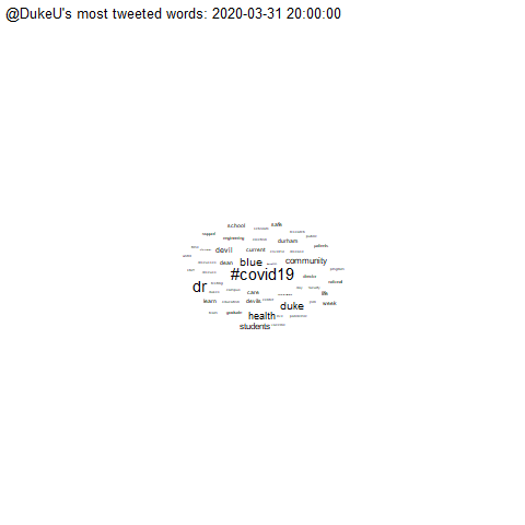
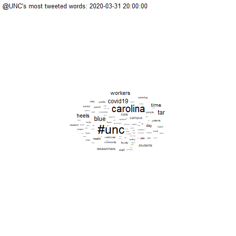
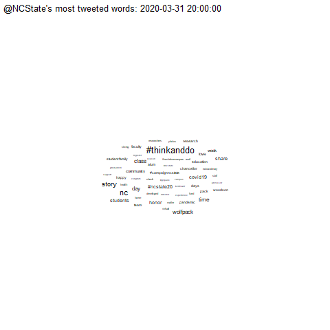
Ever since being introduced to R in my Learning Analytics program, I’ve been a huge fan. One of my favorite things to do is play around with visualizations using ggplot. For one of my projects analyzing word usage between Duke University, University of North Carolina-Chapel Hill, and North Carolina State University’s respective Twitter accounts, I used an animated world cloud to show the frequency of word usage through time in a one year snap shot. The year was dominated by the COVID-19 pandemic, so you’ll see the evolution of most frequently tweeted words nicely through use of gganimate.
I was asked to submit this use case of the rtweet package on the R forum, rOpenSci. See all three schools’ Twitter word cloud here: